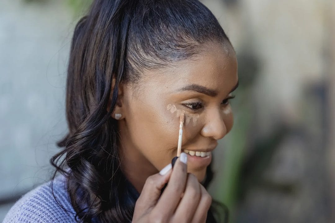
Pull up any color-correcting palette and the first reaction is usually the same: why would anyone put green on their face on purpose? The answer sits on the color wheel, not in a marketing deck. Opposite hues cancel each other out when layered thin enough to blend, which is exactly how a mint-green cream neutralizes the red flush of a breakout or rosacea patch without you needing three extra coats of concealer to bury it. Once you see color correcting as basic optics rather than a trend, the whole category stops feeling gimmicky.
The Color Wheel Part Nobody Skips Anymore
Complementary colors sit directly across from each other on the wheel — red and green, orange and blue, yellow and purple. When you layer a small amount of the opposite hue over a discoloration, the two colors visually cancel, and what's left reads as a neutral, skin-toned base instead of a colored patch. This is the exact same principle behind old-school photo retouching before digital tools existed, and it's why colored correctors work when a heavy-coverage concealer alone sometimes just smears the redness into a slightly lighter shade of red. The catch is that this only works in thin layers, applied with real restraint. A thick swipe of green corrector doesn't cancel redness — it just sits on top as its own visible color, which is how people end up looking faintly seasick under fluorescent office lighting. The corrector needs to be sheer enough that it neutralizes the tone underneath rather than adding a new one on top, and that sheerness is usually the difference between a product that looks like it's working and one that photographs green in every flash photo for the rest of the night. Most formulas are built with this in mind, which is exactly why a little goes further than the tube suggests.
Redness: Rosacea, Active Breakouts, Irritation
Green is the standard answer here, and for a reason grounded in basic optics rather than habit. A light, cream-based green corrector dabbed only on the red areas — around the nose, across flushed cheeks, directly on an inflamed breakout — flattens the tone before foundation goes on. Skip the areas that aren't actually red. Blanketing the whole face in green corrector is the fastest way to end up with a gray, lifeless undertone once foundation sits on top of it.
Under-Eye Circles: Match the Shade to Skin Depth
This is where most people buy the wrong product, because under-eye discoloration isn't one uniform problem. Blue-toned circles, which come from thin under-eye skin letting blood vessels show through, need an orange-based corrector to cancel that blue-purple cast. On fair-to-medium skin, a peach or light salmon shade does the job. On deep skin tones, a true orange or red-orange corrector is necessary — a pale peach shade disappears entirely and does nothing to cancel the underlying blue, which is the single most common under-eye color-correcting mistake dermatologists and makeup artists point to. Purple-brown pigment under the eyes is a separate problem, more common with hyperpigmentation than with vascularity, and it responds better to a slightly different approach: a warm, honey-toned corrector rather than straight orange, since orange can overcorrect and leave a muddy cast on pigmented rather than purely vascular circles. Telling the two apart is simpler than it sounds — gently stretch the skin under the eye, and if the darkness lightens as you pull, it's vascular; if it stays put, you're dealing with pigment, not blood vessels. That five-second test decides which tube you should actually be reaching for.
Sallowness and Dullness
Purple and lavender correctors work on the opposite end of the wheel from yellow, which makes them the fix for sallow, tired-looking, yellow-undertoned skin rather than for redness. A whisper-thin layer across the center of the face — cheeks, forehead, chin — brightens without adding pink. Too much, though, and the payoff reverses: excess lavender corrector reads as an actual purple-gray cast once it oxidizes with oil throughout the day, particularly on skin that runs warm.
Bruising and Broken Capillaries
Yellow-based correctors handle the fading, greenish-purple stage of a bruise and the faint blue web of broken capillaries near the nose and cheeks. This is a narrower use case than the other three, and most people don't need a dedicated yellow product in their routine — a green or orange corrector, applied a little more precisely, usually covers the same ground.
Application: Thin, Targeted, Set Before You Move On
The technique matters as much as the shade. Skin needs to be moisturized first — color correctors grip and cake on dry patches the same way foundation does, and no amount of shade-matching fixes a product that's visibly sitting on flaky skin.
- Moisturize and let it absorb for a minute or two before touching color corrector to skin.
- Dab a small amount only on the discolored area with a fingertip or small brush — never drag it across skin the way you'd apply a full-face primer.
- Pat, don't rub, to blend the edges into surrounding skin without dragging the corrector past where it's needed.
- Set with a light dusting of translucent powder before concealer or foundation goes on top.
- Apply foundation as usual — the correction should be invisible once the base layer is in place, doing its job from underneath rather than showing as its own color.
That order is non-negotiable. Color corrector goes before foundation, not after, and definitely not mixed in with concealer as a shortcut.
Where This Goes Wrong
Almost every color-correcting failure traces back to one of four habits: too much product, the wrong shade for skin depth, skipping skin prep, or applying it in the wrong order relative to foundation. Using a full pump of corrector where a rice-grain amount would do is the most common of the four — and it's the one that turns a subtle fix into a visible smear of off-color cream the moment foundation goes over it.
Applying corrector after foundation is a close second mistake, and an understandable one, since it feels intuitive to "touch up" trouble spots once you can see how the base looks. But foundation has already partially covered — and partially blended with — whatever discoloration was underneath, which means the corrector now has to fight through a layer instead of sitting directly on the problem. Go under, not over.
Do You Actually Need It?
Honestly, most people don't need a dedicated color-correcting step for everyday makeup. A well-matched concealer with enough pigment density handles mild redness and light under-eye shadows on its own, and skipping an extra product is one less thing to blend and one less thing to go wrong on a rushed morning. Color correcting earns its place when the discoloration is genuinely stubborn — deep rosacea flushing, pronounced vascular under-eye circles, or post-inflammatory pigmentation that a regular concealer keeps failing to fully neutralize no matter how many layers get pressed on top.
Treat it as a targeted tool for a specific, persistent problem rather than a mandatory step in every routine. If a single pass of concealer already does the job, adding a corrector underneath is just extra product sitting on the skin for no visible gain — and on hot or humid days, that's one more layer that can slide, separate, or crease before lunch.